Coming from WinForms or even older technologies like MFC, WPF and Silverlight are a revelation. A consistent framework to layout simple forms, draw graphics, add video and 3D images and animation and styling. All in the same window. Woo!
But there some places where WPF and Silverlight behave differently to initial expectations and which can waste a lot of developer time or even put some off entirely from experimenting with them.
Interactive Demo
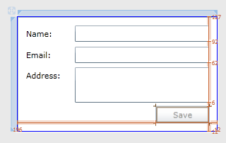
 Most layouts in WPF use a Grid control. It’s very flexible and has a lot of powerful features. The classic demos for WPF for WinForms developers show a Grid, with single cell. This is easy because that’s what you get by default when you create a new form. And it might let you add more cells later if you get more adventurous. But in the meantime you can throw your controls on, you get nice snap-lines to help you line them up, and they will stay where they are put.

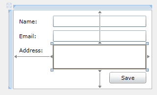
In the designer click on the circles on the edges of a control to turn them to arrows and you get simple anchoring just like in WinForms. So this allows a sizeable form and controls that will size nicely. Great! Try the Grid Anchors tab on the demo above.
 But what about some things you can’t do in WinForms easily. How about two multi-line text boxes that each resize and take up half the width of the form? Well you just handle the Forms Resize event and manually move them, only two of them so not hard. Or you can use a TableLayoutPanel.
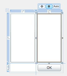
Well in WPF it’s really easy. Create a grid. Create two columns. Set the width of each column to “*” for proportional sizing. Put a text box in each of them. Reset Layout from the context-menu on both so they fill the grid cells, then maybe set a Margin on each to 3 so there’s a little gap. Done. Try the Grid Proportional tab on the demo above.
 The WPF/Silverlight Grid layout control has a third way to size cells – Auto. Coming new to WPF or Silverlight this is where you’re most likely to be tripped up. It sounds really helpful, it’ll just resize each grid cell to the control inside. A button will automatically have just enough space. A TextBox or CheckBox will always be the right height. What we were not expecting is that this automatic sizing behaviour continues at runtime. The first time you have a TextBox grow as the user types, you’ll feel very weird like you’ve lost all control over your application. Or if a list-box keeps growing as you add data to it, especially when it grows past the edge of your form. Try the Grid Auto tab on the demo above.
This feature is great when you want your form to dynamically size based on the number of data items. And it’s nice that this has been allowed by a consistent approach to sizing to the current data. But it’s wierd when you’re not expecting it. Everyone needs to play with these layout options to be comfortable using them where they’re useful and not having them occur accidentally when not expected. I’ve currently got a couple of recommendations to help avoid mistakes:
Use separate layout controls for each clever piece of layout
Want two columns that each stay half the width? OK, use a Grid with proportional (*) sized columns.
Want several controls to just stack after each other? OK, use a Grid with Auto sized rows or a StackPanel.
But although a single Grid can do everything, it’s both harder to set up and fragile under changes later.
In WinForms multiple layout panels would have been costly as each would be a real window taking up resources. In WPF layout controls are lightweight and fully composable with little overhead and events are routed up and down the control hierarchy so you can handle them wherever you want. So in WPF it makes sense to create one Grid just for the two half-width columns. Put that in a StackPanel so everything else appears below it. Wrap the whole thing in a ScrollViewer so if the screen’s too small the form will scroll. Then each clever piece of layout is clear and can be split into UserControls for reuse.
Only use Grid Auto sizing for fixed sizes
Buttons don’t change size so using Auto for Height or Width of containing Grid cell is safe.
Single-line TextBoxes don’t change height so using Auto for Height is safe.
But in WPF controls will change size to accomodate the data AT RUNTIME if in an Auto Grid cell. So the Width of a TextBox, the Width and Height of a ListBox should be constrained in a Fixed or Proportional Sized Grid Cell.
Until you really want your form to grow for each new data-item. Then Auto is just what you want.
No Comments